Insight
STORY
During my internship at Odyssey Gaming, I participated in a project called Insight BI. Insight is a business intelligence platform which provides business clients with player information collected from gaming venues. Some examples of data include player performance, EGM (Electronic Gaming Machine) performance, daily profits, and POS sales. The data helps gaming venues make decisions on how to improve their business and profits.
role
This was a 12-week internship at a company located in Brisbane, Queensland Australia. The project was led by a Senior UX designer, and my main role and responsibility included screen designs and user research.
Problem
In the past, the company, as a Licensed Monitoring Operator, has been providing customers another BI (Business Intelligence) platform that belongs to another company. Now the company wants to build their own platform, based on the same type of information, but with a new look and more user-friendly interface.
Research & Design
Personas
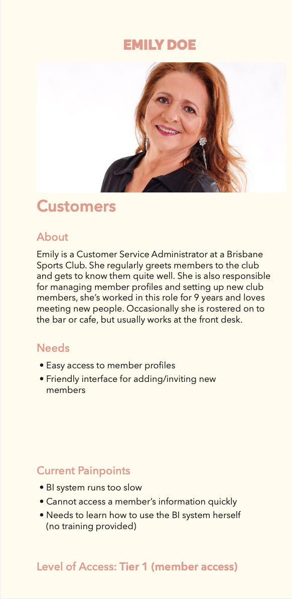
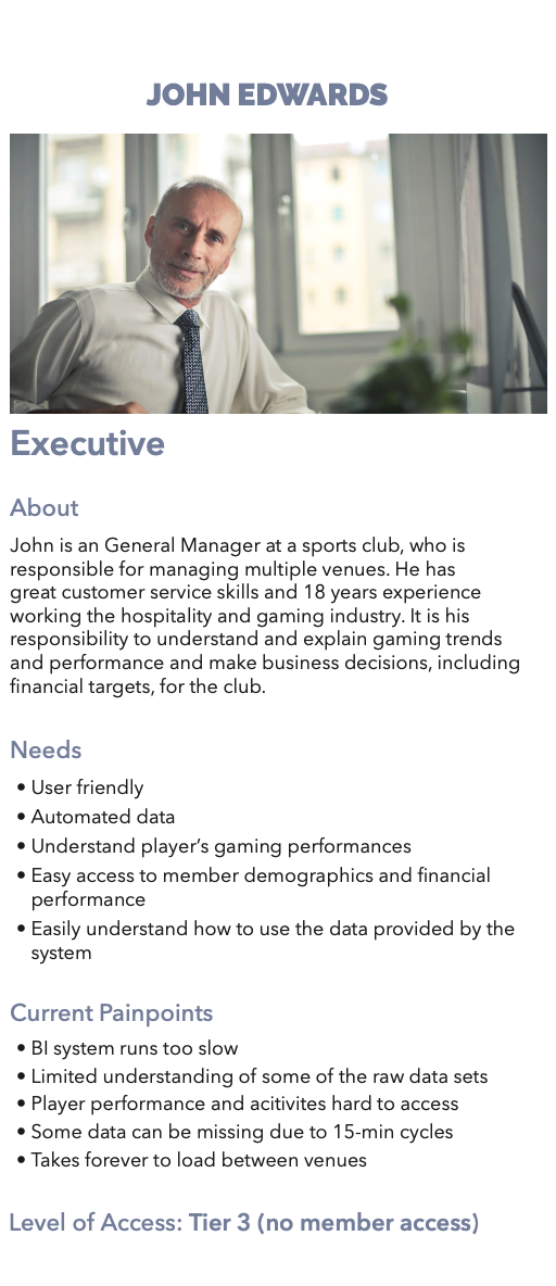
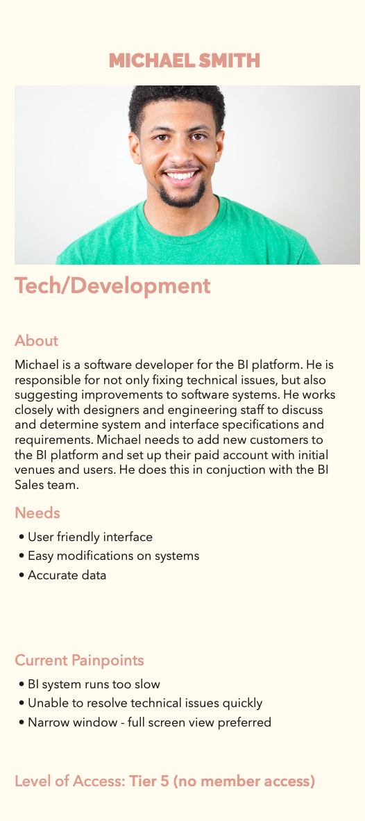
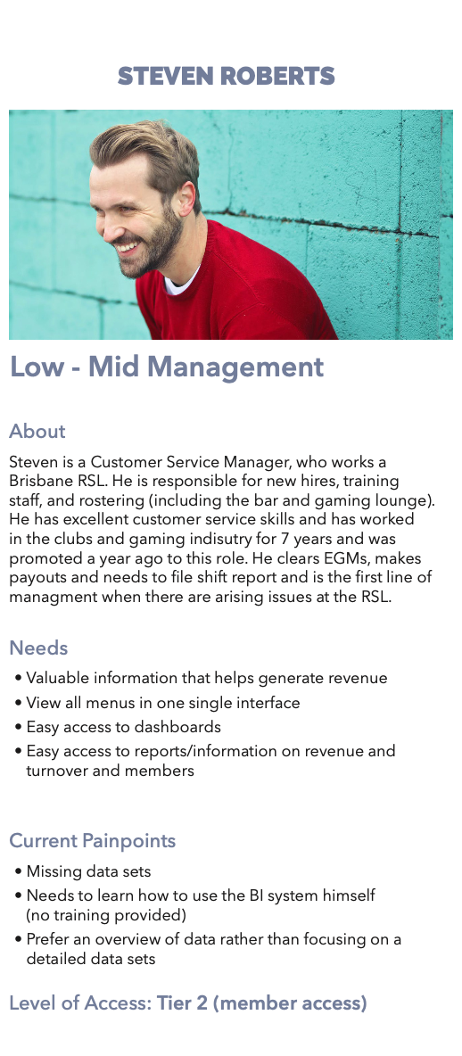
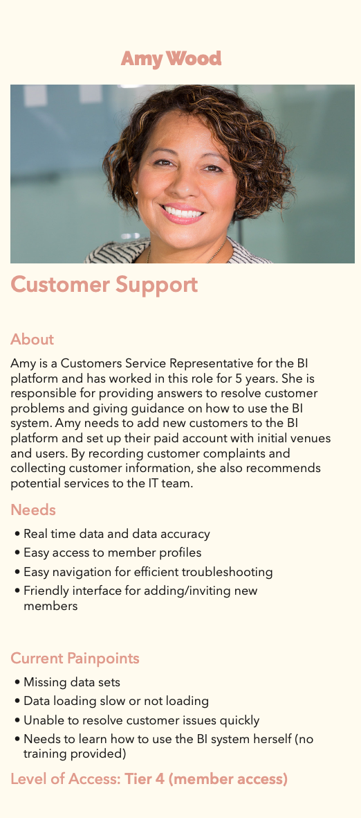
When I came onboard, a lot of research had been done already. Interviews were conducted with staff from different departments. Based on the notes, I created 7 personas, each with a different role within the organization. Each persona includes the person’s needs and the painpoints when using the current BI platform.
Depending on the position, different staff should have different levels of access to information. Therefore, we need to understand what part of the platform each staff mainly uses in order to categorize them into different tiers.
Site map
This platform is a rather complicated system, so creating a site map helps us and everyone involved in the project have a better understanding in the structure of the system, what the users can do with the system, and how features communicate with each other.
Style Guide
Since it is an entirely new product, we had to create our own style guide, so that there is a universal visual language across the designs for different parts of the platform.
Information Hierarchy
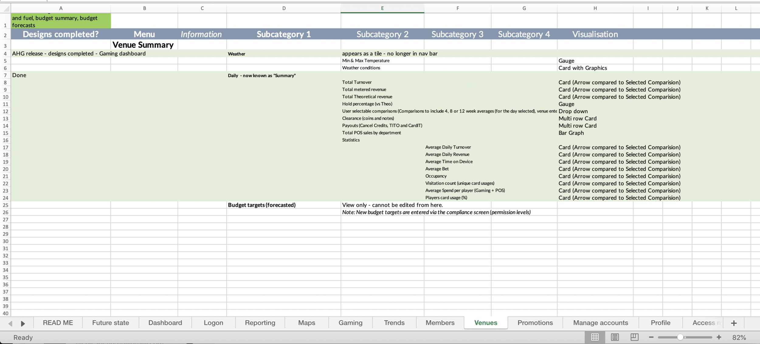
A list of system requirements is put together into an Excel spreadsheet. It serves as a guideline for us to understand what sort of information should be included in each screen.


UI Design
I’ve chosen two components that I was mainly responsible for: “Members” and “Promotions”
Members
Key points
Member detail cards: Each member (player) is displayed in a card with a photo and information including name, tier, membership start date, and current membership points. In order to view other detailed information, the user will click on each card.
Player rankings: A table of players ranked by turnover (money wagered before any winning or losses). Users can click on each row to view more details of the selected player.
Player ranking details: Detailed information of the selected player is contained in a pop-up modal box.


Key challenges
Organizing information: There is a lot of information that needs to be displayed for every single player, so we need to make a decision on what information is more important and needs to go into the table and what information is secondary and needs to go into the modal box.
Visualizing information: Data visualization is always important in UX design. Here, we choose to present some of the data in graphs and charts. After all, isn’t it boring if all the information is in the table?
Access for staff of different tiers: Player information should be secured, and for people who do not need access to personally identifiable information, such as name, address, and phone number, we hide the information by default. If the logged in member has access to the information, they will be able to click on the icon of a person with a shield to expand the information section and view the personally identifiable information.
Promotions
Key points
3 types of promotions: One of the features of the platform is the reporting on data related to promotions. The three types of promotions are Gaming, Kiosk, and Campaign. Each type of promotion has different data that need to be included.
Create/add to member groups feature: a feature of selecting players and add them to a certain promotion group.


key challenges
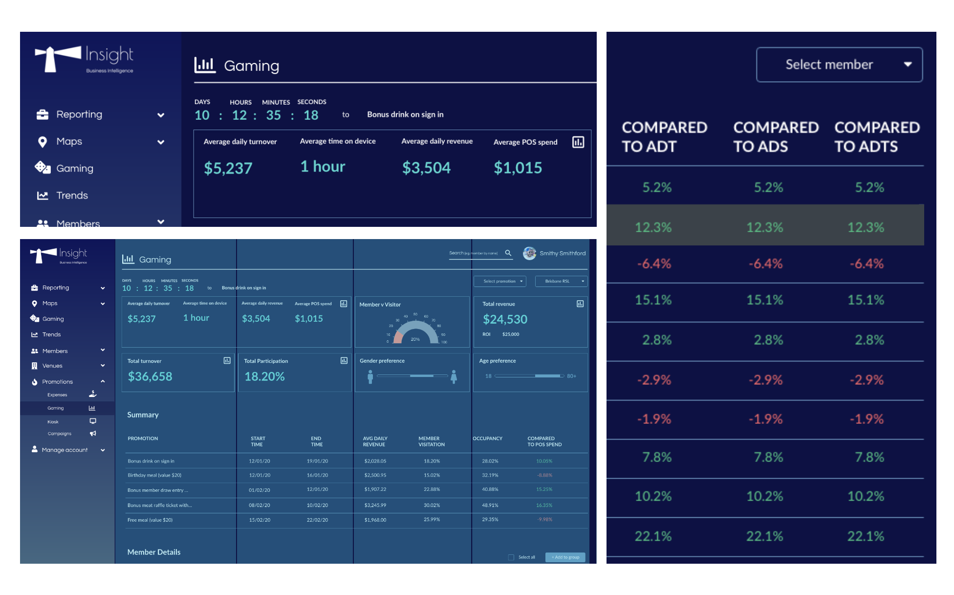
Number comparisons in tables: There are some items in the table that needs to be compared with other measurements. (Individual player’s Average Daily Turnover (ADT) comparing against the selected promotion’s ADT). The challenge was how to incorporate number comparisons into the table since there are many other items in the table already. The solution was to include the number comparison in the end of the table and use colors to mark the difference. Color #E56B6B (salmon) is used to indicate less than, and color #5EBE86 (green) is used to indicated greater than.
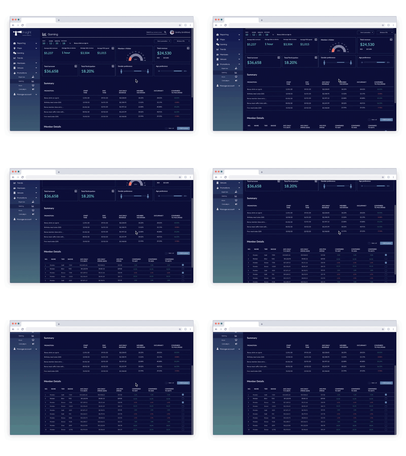
Layout: For promotion related to Gaming, a mix of cards, tables, and graphs are used in one single screen. The challenge is that there is a lot of information that needs to be presented in several different ways, and while the layout needs to stick to a 4 column grid, the information also needs to be readable and easy to process for the users.
Organizing information with cards: Some of the information is more important than other and needs to be in a card (boxes at the very top). My supervisor and I agreed that cards should be limited to two rows because having more than two rows would make the information less significant. However, there are situations where the data that need to be in cards cannot fit into two rows perfectly. The solution was to group relevant data together and put them into one big card. In this case, not only that all the data can fit into the cards, but also relevant data can be compared with each other.
Clickable Prototype
The main software tool used for the design is Adobe XD, and a clickable prototype was created for us to gather user feedbacks. We also prepared a questionnaire with 10 questions, so that we are clear what kinds of feedbacks we are seeking from our users.
Outcomes and Lessons
By the end of my internship, the platform hasn’t been officially released, but 90 percent of the design work was completed already. This is my first time designing such a complicated system as a UX designer, and I have learned a few things:
Communication: It is important to work closely with the front-end team, as designers can learn from them what can or cannot be done and what features can be achieved more easily than others in a technical perspective. Only through close and ongoing communication between the two that UX designers can find the best solution for the user problems.
Style Guide: The beginning is always the hardest. I remember for my first design task for this project, I spent much more time than I did in my last month of internship. I learned that improving your industry knowledge and setting up a style guide really helps with this. A style guide is so important because it establishes design principles and conventions that are specific for the project. It gives you guidance and helps you get started with your first screen design.
Data Visualization: Data visualization is an important element when it comes to user experience. Before doing the UI, you need to understand what the data is about, who are the people who read and use these data, and what are the potential ways to show these data. The project is a rather complicated system that is data-heavy, and the challenge that often occurs was how to organize and present different sets of data on one single page.


